Of course there are many people who blame the housing bubble, in general, on loose monetary policy - the Fed held rates too low for too long and that caused buyers to borrow too much and to bid up the price of homes to unsustainable levels. I have concluded that this is not correct.
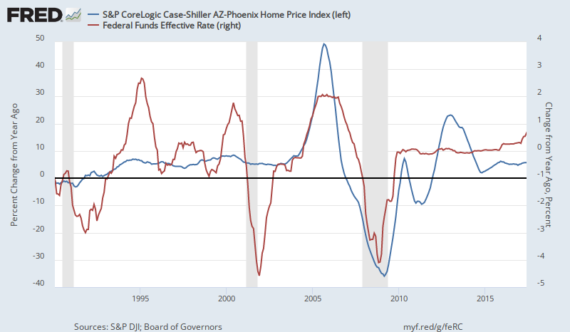
But, all of that aside, and the "cause" of debating the truth of the matter, learning better policy prescriptions aside, given how widely that belief is held, these graphs are just funny. If any Fred graph could make you laugh out loud, these have to be them. The first graph is the price level in Phoenix compared to the Fed Funds rate. The second graph is the one year change in the price level in Phoenix compared to the one year change in the Fed Funds rate.
 |
| Source |
Come, on. That's funny.
 |
| Source |
Bob even kindly copied the graphs into a new post for his readers. There wasn't much reaction to it. I really didn't even get to see many explanations. I think I am accurately portraying the reaction by saying Bob and his readers didn't feel like this needed an explanation because these graphs are self-evident confirmations of the Austrian theory that low interest rates cause asset price bubbles.
 Bob thought this third graph was the best way to look at it - with the Fed Funds level and the change in prices. When prices were accelerating in 2005, rates were rising, but they were still relatively low compared to previous cycles, so they were still capable of fueling the bubble.
In the current version of the manuscript I am finishing, I sometimes try to get the reader to mentally commit to a stated expectation before I review the actual data. I wonder if I should even place empty graphs in the book and say, before you read the next chapter, draw a graph of what you think, say, homeownership rates did over this time period. I think if I asked a room full of 100 Austrian BC proponents to draw a graph of home prices and interest rates, none of them would draw anything like this. The blue hump would be one or two years earlier, at least. None would have prices decelerating in 2002 and 2003. But, upon seeing the actual graphs, fully 100 of them would agree that they had all miscalculated and placed the price run up too early.
 |
| Source |
Whatever else you might say about it, though, the Los Angeles graph isn't very funny.
Superb post.
ReplyDeleteWhen it comes macroeconomics, most practitioners emulate my late, great Uncle Jerry, who said, "Even if it is true, I still don't believe it."
There is a clump of people who believe money should be tighter, everywhere and always. They talk about gold a lot (for some reason, the silver standard is not popular). After 40 years of disinflation and deflation, they still describe central banks as statist-inflationist institutions. In the present-tense, too.
A toughie going forward: Of course, the US closed-access cities are not the only cities in the world with skyrocketing house prices. This is seen is Great Britain, Australia, NZ, Canada, Hong Kong.
Monetary authorities have a dilemma: 1) Keep monetary where it helps general economic growth, but explodes house prices, or 2) flatten house prices and suffocate the economy.
This Hobson's choice is so distasteful that the right answer in orthodox macroeconomic circles is 3) Let's not talk about it, but reinforce our intellectual and politico-economic bulwarks.
I guess we have already seen the middle-class priced out of housing in closed-access cities, and the aforementioned nations.
Maybe there is a plateau out there somewhere, for housing prices, without suffocating the economy. Maybe getting there in Great Britain.
Would be better to un-zone property or balance trade deficits.